

It might not surprise you to find out mobile traffic is growing exponentially these days. That means if you’re running a blog, you’re no longer catering to mostly desktop users and you have to adjust accordingly. Otherwise, you risk alienating a significant part of your audience.
Fortunately, optimizing a website for mobile traffic isn’t as complicated as you might think. It’s all about making sure the site offers a great experience on mobile devices as well as on desktops. That way, your users will be happy checking out your blog regardless of which type of device you’re using.
In this article, we’ll talk a bit more about the importance of mobile optimization. Then I’ll tell you about the best two ways to ensure your blog is as mobile-friendly as possible. Let’s get to work!
Why Mobile Optimization is Important


Optimizing your website for mobile access is all about adapting it for more compact resolutions. The less space you have to play with, the fewer elements you can display, so you need to be picky about what your visitors can see.
It used to be the case that we had to pinch and zoom our way around most websites on mobile. However, these days you’ve probably noticed that’s not as common. Here are a few reasons why.
- Mobile traffic already surpasses that of desktops.
- Bad mobile optimization can lead to higher bounce rates.
- If your website doesn’t play nice with mobile users, you’ll get a lot fewer conversions.
These days, I always recommend people approach the idea of building a website from a mobile-first point of view. That is to say, mobile optimization shouldn’t be an afterthought, but something you consider from the get-go.
If you’re thinking about starting a new blog, we can help you set up a mobile-friendly website through our Beginner Blogging course. We’ll take you through the entire process, from setting up WordPress to finding a mobile-friendly theme so you can hit the ground running. If you already have a website up and running and you’re wondering how to optimize it for mobile, we have a couple of tips for you.
2 Tips to Optimize Your Blog For Mobile Traffic
If you’ve spent some time around the Leaving Work Behind blog, you’ve probably noticed we’re big fans of WordPress. It’s not the only blogging platform available online, but it’s my favorite due to how incredibly customizable it is. With that in mind, this section will focus on WordPress-specific tips for mobile optimization.
1. Choose a Mobile-Friendly Theme

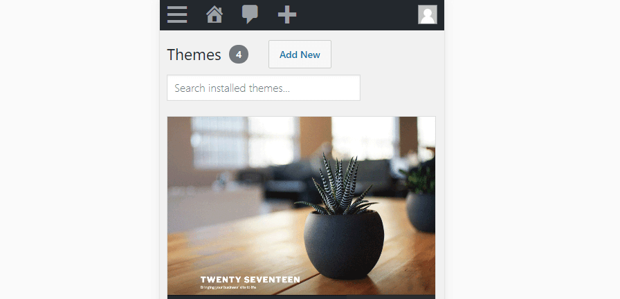
WordPress themes enable you to customize your website’s style in almost any way you want. Whatever type of website you want to create, there’s bound to be a theme for it.
There are a lot of things you should consider when it comes to choosing a WordPress theme. For example, it should have excellent reviews and pack features that will make your life easier. However, one of the most important criteria to keep in mind is that the theme you pick should be responsive out of the box.
Responsiveness is the degree to which a website adapts to mobile interfaces. When we talk about responsive themes, we mean those that enable you to build pages and publish posts that work perfectly on mobile with little effort on your end. These days, most popular WordPress themes take pains to be mobile-friendly, so you shouldn’t have problems finding the perfect one.
In any case, almost every WordPress theme marketplace enables you to see demos of your picks. If you access those demos through a mobile device, you’ll get a good idea of how responsive they are.
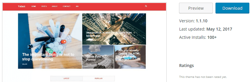

Premium themes for WordPress can be expensive, so you should never buy one without testing it firsthand. If you’re on a budget, there are also plenty of excellent free blogging themes to choose from.
2. Streamline Your Blog’s Navigation


When it comes to mobile websites, there’s nothing worse (at least for me) than having to deal with clunky menus. If I have to scroll around to find all your menu items, I’ll probably hit the back button and look for another, better-designed website.
It’s on you to make sure your website is as easy to navigate as possible. That is something you need to keep in mind for both desktop and mobile users. However, it’s much more critical for the latter since you have less space to play around with.
If you’re using a mobile-friendly WordPress theme, chances are its menus are already responsive. There are a lot of ways to approach this problem. For example, some mobile sites hide their menu items behind ‘hamburger’ buttons, as in the example at the start of this section.
Others use tricks such as hidden sidebars you can access by swiping. All these approaches work, but the first thing I do when it comes to mobile menus is figure out if I can remove any elements from them. For example, on desktop sites, I might include social media links as part of my menus but move them elsewhere for mobile users.
Some themes provide you with a greater degree of control over the placement of your elements on different devices. If yours doesn’t, you might want to look into using a plugin solution, such as Responsive Menu:
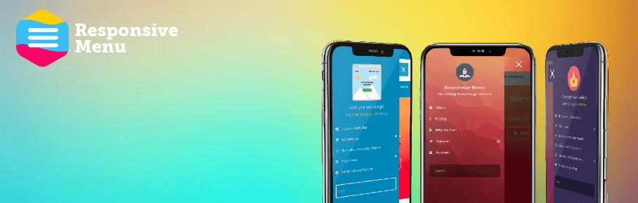

This plugin enables you to set up responsive menus for mobile users. You can choose from a wide variety of layouts and customize how they look so you have full control over your site’s mobile experience.
The larger your website is, the more complicated its navigation will be. Massive stores such as Amazon, for example, can’t help but have gigantic menus with dozens of categories. When it comes to blogs, however, there’s no reason to complicate things. In fact, the simpler your navigation is, the better your user experience should be.
Conclusion
These days, everyone expects the websites they visit to look amazing on their smartphones. If your blog isn’t up to par, you’ll lose out on a huge chunk of potential traffic and conversions. More importantly, the rise in mobile traffic isn’t likely to stem anytime soon. The longer you wait, the bigger the consequences for your website.
If you’re ready to jump on the mobile-friendly bandwagon, here are the two most important things you need to remember as a WordPress user:
- Choose a mobile-friendly theme and you’ll win half the battle from the start.
- Streamline your blog’s navigation so your users don’t find it frustrating to move around your website.
Do you have any questions about how to optimize your website for mobile? Let’s talk about them in the comments section below!
Image credit: Pixabay.