

Most bloggers launch a new design in the hope that it will boost key metrics like average page views and bounce rate, with a view to ultimately boosting their bottom line. I took a contrarian approach based upon a vision of what I wanted the site to be. As I said when I announced the new design, “Sometimes you just need to do something because it feels right.”
It feels as right today as it did back then, but I know that some of you were interested in how the new design would perform. It’s a question I was keen to answer too – after all, it’s not every day that you get to observe the effects of such a radical design change.
In this post I’ll reveal just how the design has affected key metrics and then ask you for your comments and/or suggestions as to what I can do to make the site even more effective!
Out With the Old, In With The New
I loved the old Leaving Work Behind design when I first launched it, but over time my adoration faded. It got to a point where I wanted to step away from an image-heavy, ‘commercial’ design and bring the site back to its simple roots.
Leaving Work Behind is largely a reflection of me: the principles I hold dear and the actions I take in an attempt to improve my life. The design no longer felt like a reflection of what I feel is important: an appreciation of the happiness that can be found in relatively simple living. Don’t get me wrong – I like having my creature comforts and gadgets – but over the past several months I have gained a far better appreciation that those things do not ultimately determine one’s happiness.
And that is exactly why this new design is so simple. The old design felt thoroughly overwhelming to me, and I wanted to create something that provided a comforting simplicity and brought clarity to the visitor’s experience.
I’m also a massive geek and wanted to have a crack at designing the site myself. Given my limited web design skills, my involvement necessitated a simple design!
The Numbers
I put little thought into how the design would affect metrics. I decided that if I followed my heart and built something that felt right for me and the blog, engagement would improve naturally.
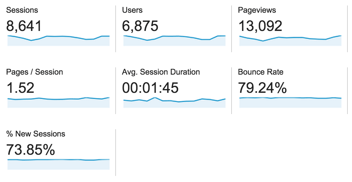
Fortunately, I was correct. A comparison of the weeks before and after the launch of the new design tell an encouraging story:
Before (29th October to 11th November)

After (12th November to 25th November)
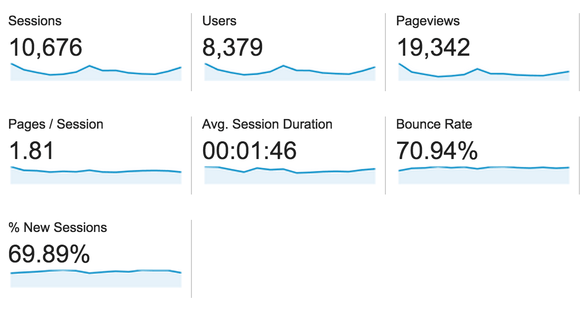

As you can see, all of the engagement metrics have moved in the right direction:
- Page views per session are up 19%
- Time on site is up 1%
- Bounce rate is down 10%
Considering that the pessimist in me was hoping that the metrics wouldn’t go too far the wrong way, I’m pretty pleased with these numbers!
So far so good. But I’ve not addressed what is perhaps the most important metric in most people’s opinions: email subscribers. How have they fared since I switched designs?
Not well.
The conversion rate of unique visitor to email subscriber was pretty poor before the design change – 1.7% during the first twelve days of November. But things got much worse when the design changed – the conversion rate almost halved to 0.9%. In fact, in the last week I’ve lost more subscribers than I’ve gained!
I’m not surprised in the slightest by this. Putting the design to one side for a moment, I removed two key conversion tools on 13th November: my Optinmonster exit-intent popup and my Many Contacts bar. I don’t know if the design really made things worse, or if the removal of these conversion tools did the damage.
Either way, the vast majority of bloggers would tell me that I should work hard on increasing the number of email subscribers I have. I’m not so convinced. While the commercial argument that email subscribers are more valuable than any other type of visitor to your site, part of me wants to acquiesce to the “they’ll subscribe if they want to” mindset.
What Next?
As it stands, I’m pretty happy with the design. What I’d most like to address is a means by which visitors can more easily navigate through the site. My proposed solution is to add an Archives to the navigation bar, but I’m not rushing into anything just yet.
The key question is arguably what to do about email subscribers. Like I said, I’m in no rush to make major changes, and I’d love to know what suggestions you might have on that front. In fact, I’d love to read any comments and/or suggestions you have about the design, so fire away in the comments section below!