
What you saw was the culmination of months of hard work. The creation of a brand new design (that completely matched the vision I had in my head), a manifesto and community forums was a far greater challenge than I originally envisaged, but I am delighted with the outcome.
I now feel like I have a solid foundation upon which I can build something that will have a hugely beneficial impact on many people’s lives.
Over the next few weeks I will be exploring elements of the new and improved Leaving Work Behind in order to reveal the thinking behind the finished product. In this post I am going to focus on the design in great detail – from the inspiration and thinking behind it to the entire design process from start to finish.
Why Did I Want a New Design?
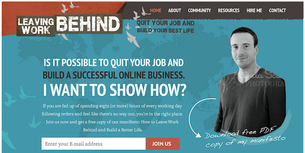
I’d received plenty of compliments about the old Leaving Work Behind design in the past, but I was never totally happy with it. It always felt like a placeholder to me.

While I was very happy with certain elements of the design (such as the logo, introduced as part of my May 2012 re-launch), its structure and style did not ultimately reflect where I wanted the site to be.
I wanted something that really looked the part. Something that truly reflected the strength of my desire to help people. To revert to British slang, I wanted something that looked like the dog’s bollocks:

Beyond that, I wanted a design that was built from the ground up to capture email addresses. While in the past I have been relatively reticent to get readers to sign up via email, I am now fully reconciled to the realization that the best possible way I can help people is by making my way into their inboxes.
Why? Because it is only through email that I can feed people information in an ordered, chronological format. Blogs don’t lend themselves to that kind of information consumption. My reasoning was (and is) that I would be benefiting people by making subscription by email the number one option for people visiting my site.
While I felt that I could achieve my aims by tweaking the existing design, I knew that spending more money on something that did not represent where I wanted the site to ultimately be was rather pointless. Better that I spend a little more money and go all the way with my vision.
Initial Design Inspiration
I had a pretty good idea of what I wanted the site to look like before any real work started. If I could pinpoint the exact moment at which my inspiration was first sparked, it would have been when the new Think Traffic design was launched back in May 2012. I was blown away by simple structure and bold use of color.
I soon discovered that the design was the brainchild of Chase Reeves, interviewed here by Corbett Barr:

Set aside 45 minutes to watch that video – the guy’s a complete dude.
Chase went on to re-design Paid to Exist and Nerd Fitness, both of which look awesome. While I wanted the new Leaving Work Behind design to be unique, I also knew that I wanted to use Chase’s designs as inspiration for my own.
In Search of a Designer
I knew that I wouldn’t be able to create the design alone. While I had gotten by with customizing the fantastic WooThemes Canvas framework for the original design, I knew that the look I was going for would be beyond my modest abilities.
There was a period of weeks after deciding that I wanted a new design where nothing tangible happened. The truth is this: I was having a nightmare finding someone to help me.
At first I thought I could create a new design in conjunction with the chap I had used on the old design, but he was unavailable. I even reached out to Chase, but he was also unavailable – busy working on Fizzle.
Finally, I sent emails out to a handful of web design firms that I liked the look of (I didn’t find many to be honest). Some didn’t get back to me, some came back with outrageous quotes ($30k being the most laughable), and just one gave me a price that I could bear: $3,000. We were all set to go until he disappeared. I didn’t receive a response to a simple email asking for confirmation of the scope of works and that was that.
To be honest, I now see it as a blessing in disguise – I wasn’t totally sold on the guy’s portfolio and was only really going with him on the basis that I felt I had no other options. It’s funny that what seems like a problem at the time can in fact be preventing an undesirable outcome.
It was then that my previous experience with 99designs came to mind. I had used the service to get my logo designed back in 2012 – a logo that I was (and still am) delighted with:

99designs gets a bad rap in certain circles for “commodotizing” creative work, and while I do understand that argument, I come from the perspective that we live in a capitalist society, and 99designs is capitalism at its purest: supply and demand.
With that in mind and having failed to hire someone independently, I decided to move forward with 99designs.
The First Design Phase
With moral dilemmas put to one side, I set out to get my hands on a visual representation of the new Leaving Work Behind design.
This was arguably the most vital stage of development – the stage of true creation (as opposed to the translation that was the coding stage).
You can find the full brief I submitted here. As you can see, I went into a lot of detail, referencing four of Chase’s designs: Nerd Fitness, Think Traffic, Paid to Exist and Fizzle.
I received over 40 designs. Here’s a selection of the contenders:


As you can see, the offerings were somewhat mixed in quality. The winning design was actually a last-minute submission. Before it came through, I was strongly considering canceling the competition (as you can get a full refund if you don’t proceed to final stage). Thank God for that final submission!
You can find the winning design here, by a chap called Mithum. As you can see, it is largely the same as the final product.
If you plan to use 99designs I have three pieces of advice to give you:
- You’ll only get out of it what you put in. Be prepared to give a lot of specific feedback and work closely with the designers to get something that matches your vision. If you just sit back and hope for the best, you probably won’t end up happy.
- Be ready to repeat yourself. Many designers seemingly completely ignore the brief and go off on their own creative jaunts. This can be a good thing (if they think up something really cool that you never had in mind), but more often than not it aint so good (e.g. when a designer ignores a vital element of your design). You’ll need to repeat elements of your brief, perhaps multiple times, in order to get what you want.
- You have to dig deep to find the diamond in the rough. Both times I have used 99designs, there has really only been one design that I’ve loved. But it only takes one. Be prepared to dig deep to find that that one design you’ll love.
Once I had selected a winner and the competition had closed, a Photoshop file of the design was emailed to me and I made the payment: £599 (just under $1,000). I was very happy with what I had for that price.
The Second Design Phase
I had my design – now I just needed to make it real. That’s where I turned to my most trusted contractor: Tito Pandu Brahmanto.
I first spoke with Tito when I was just getting my feet wet in the world of WordPress plugin development. I had developed a very basic WordPress plugin that enabled you to embed pre-formatted tweets within links – like the Click to Tweet service. He helped me develop that plugin into something far more sophisticated, and since then we have worked together on other WordPress plugins such as Evergreen Post Tweeter and Advanced Comments Moderation (with more to come in the future!).
It seemed that no matter what challenge I threw at Tito, he was up for it. And if he didn’t know how to do something, he’d figure it out. I knew he was the guy to help me set up Leaving Work Behind.
I sent the Photoshop file to him and asked him to create it as a website for me, based upon the Genesis framework by StudioPress. I chose Genesis because it is:
- widely acknowledged as one of the best WordPress theme frameworks available, and
- optimized to run on Synthesis, which Leaving Work Behind is hosted on.
Over the course of a few weeks (and with a number of iterative improvements), the design took shape. To give you an idea of how in-depth this process was, here’s an example of just part of one email exchange between Tito and I:

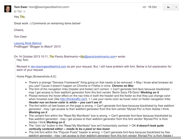
Yeah – it got pretty fiddly. And yes, I am a perfectionist and an absolute nightmare to deal with and Tito should have a medal for putting up with me. But when it came to the finished product, I wanted nothing short of the crystal clear image I had in my head.
If you’re interested in working with Tito then you can email him: tito@pandubrahmanto.com. I have nothing but good things to say about him and his work.
Launch Day
Once everything was in place, we were ready to push the button. On the afternoon of Monday, 4th November 2013, Tito put Leaving Work Behind into maintenance mode. It stayed that way for around three hours while we worked together to ensure that everything was as it should be.
There were a number of snagging issues that needed to be taken care of and I didn’t want to go live until I was sure that everything was in order. You’d be amazed at all the little things that come to light when the crunch time comes – all the little things you hadn’t noticed before that suddenly become vital issues that must be fixed.
What I haven’t mentioned in this post is the design of the new email autoresponder, manifesto and the community forums and how they tied in with the creation of the website design. All three of those topics deserve posts of their own, and they will get them in the coming weeks!
With that said, once all of the snagging issues were resolved I had Tito take the site live. I published the re-launch annoucement post, sent my subscribers an email, sat back and took a deep breath. By this point it was about 4pm and I had plans for the evening, so I only had an hour or two to make sure that everything was working okay.
Additional snagging issues presented themselves within those first few minutes, but Tito was quick to zap them. Soon enough, the smoke cleared and the comments started rolling in – of which all but one were positive. In fact, many were effusive in their praise of the new design. Mithum and Tito had done a truly awesome job.
Dissecting the Design
A lot of thought went into the design (to put it mildly).
I have already said that I was heavily influenced by Chase Reeves’ work, but at the same time I wanted to create something unique. Most importantly, I wanted to create something that reflected the Leaving Work Behind brand effectively and put email subscriptions front and center as the main action that I wanted readers to take.
For me, the design represents the coming-together of 2 1/2 years of blogging experience. At this point, there is nothing I would change.
With that in mind, let’s take a look at the main elements of the design and the thinking behind each one.
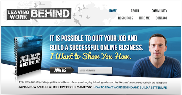
The Color Scheme
One thing I knew that I wanted in the new design was color. I always felt that the previous design was a little drab and gray, and I saw the new design as an opportunity to implement a major change on that front.
However, I didn’t want to go overboard with color. In fact, I only wanted to use two “accent” colors: one (used relatively liberally) to highlight important areas and another (used sparingly) to highlight specific calls to action. Mithum did a great job in combining blues and greens to this effect:

To get a better idea of the purpose of my color scheme, check out this list of areas where green is used on the home page:
- The feature box signup button
- The “Learn More” button in the sidebar About widget
- The footer signup button
- The “Learn More” button in the footer
Basically, greens enables just two outcomes:
- Signing up to the email list
- Visiting the About page (which contains another green signup button)
I wanted the rest of the design to remain relatively colorless by comparison: I felt this would lead readers’ eyes to all the right places.
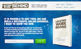
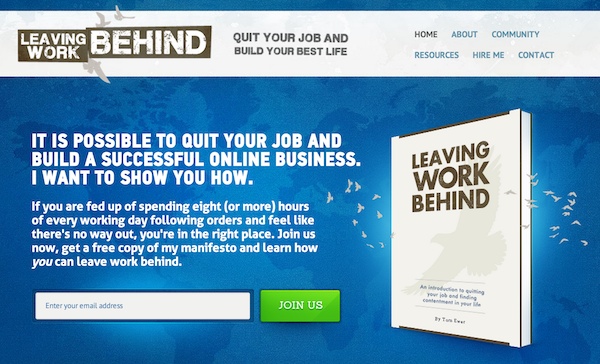
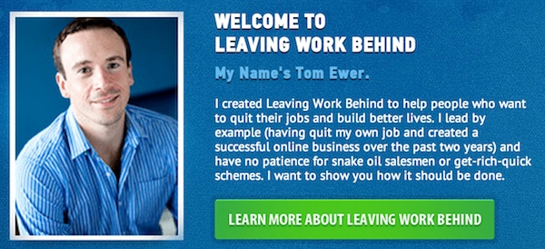
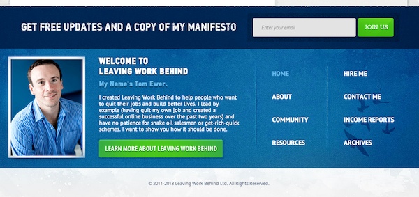
The Header and Feature Box
I knew that I wanted to keep the existing Leaving Work Behind logo (originally inspired by Live Your Legend), but not in its existing guise.
Why? Because the previous design had a pretty enormous header which took up a lot of screen real estate. I knew that I wanted my first email subscription option to be well “above the fold,” which meant that the header would need to be smaller.
With that in mind, I chose to go with a Think Traffic-style header layout, with the logo to the left and the main navigation links to the right. Despite going with a “compressed” header, I was able to the Leaving Work Behind logo, the birds motif (which I really like as a symbol of freedom) and the tagline without any of it looking crowded.
What was now missing from the previous header was the world map, which I really liked as a symbol of location independence (incidentally, I was originally inspired to include this by Chris Guillebeau’s site). Fortunately, incorporating the world map within the feature box worked perfectly. The bold headline, blurb and big manifesto eBook cover finished off the “above the fold” view on the homepage nicely – in fact, you wouldn’t think the site is a blog at first glance.
The feature box is only present on the home page – on all other pages the visitor sees just the header. To compensate for the loss of the feature box, a mini feature box is included within the sidebar:

My thinking behind this is simple: if someone goes directly to a content page, their primary goal is probably read to the content. So I make it easy for them. If on the other hand they want to explore, the first place they’ll probably go is the home page, which is where they get hit with the big feature box.
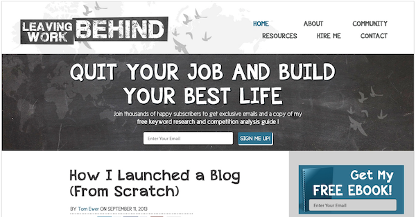
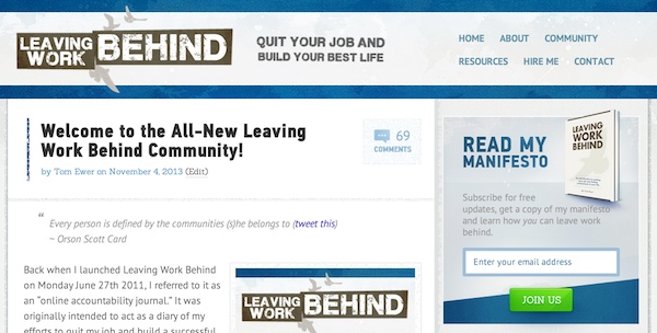
The Content Area
When it came to the content, I didn’t want to do anything too drastic, otherwise I’d have to go back into the archives and do a lot of editing to get things to fit into the new design. Because of that, the content area is probably the least-changed part of the design.
Instead of going for a major overhaul, I decided to go with small tweaks and graphical touches, such as the headlines:

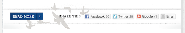
My favorite new touch in the content area is probably the horizontal share bar, decorated with the LWB birds motif:

I also made the decision to add the “Leave a Reply” comments box above the existing comments (rather than below). I believe this makes far more sense in terms of usability (i.e. if someone wants to leave a comment they don’t have to scroll to the very bottom of the page).
The Sidebar
I am a big fan of relatively minimalistic sidebars, so as to not overwhelm visitors, and I have kept that in mind with the new design. The sidebar contains just a handful of widgets (some of which appear or disappear depending upon which page you are on):
- An About box
- An email list signup box
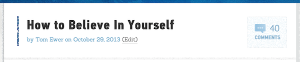
- Popular posts (five posts)
- A button linking to my Successful Freelance Writing Online course
- A button linking to my Resources page
- A search box
That’s it! No superfluous widgets, no adverts. The only thing I might consider adding in the future is a social media widget so that people can join my Facebook and Twitter channels, but to be honest, I am loath to detract attention from my main intention (to get people to sign up via email).
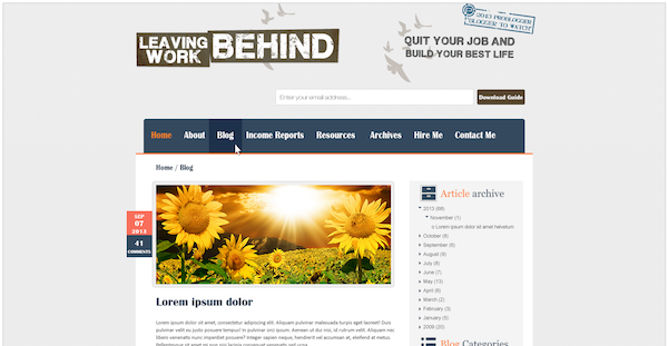
The Footer
The footer was all but non existent in the previous design. In fact, it was just a bar with some copyright text:
![]()

I wanted to create something more substantial in the new design. Most importantly, I wanted a final reminder to sign up to the email list. Beyond that, I thought that a small About section as well as extended navigation links would work nicely.

There’s nothing particularly sophisticated about the footer – the one thing I would say is that I took this opportunity to include links that aren’t otherwise available in the header: namely Income Reports and Archives. Although these links would ideally be in the top navigation, that would make things rather cluttered and potentially overwhelming. Including them in the footer is the compromise I came to.
The End Product
I’ve said on more that one occasion in this post that my main aim was (and is) to get people to subscribe (more information as to why will be divulged in a future post). I feel that the design does this well, which means that (in my eyes) it is a success.
And although it has only been three days, the numbers tell a positive story so far: email list subscription rates have approximately doubled since the launch. It’ll be interesting to see how these fare over a longer (and more statistically reliable) length of time. My instinct tells me that conversion rates will remain higher in the long haul.
However, most importantly, this new design offers a rock solid platform upon which I can build. Although the previous design did a decent job of looking okay, it didn’t really do a good job of clearly communicating my message. I feel that the new design does. As soon as you hit the home page, take in the imagery and read the feature box blurb, you have a very good idea of how the site can help you (or at least, how I intend for it to help you).
That, arguably more than anything else, is the number one thing I wanted to achieve – even if I didn’t realize it until now.
What Do You Think?
Now we’ve explored the design in detail and I’ve shared my thinking behind it, I’d love to get your thoughts. Do you like or dislike the design? Love or hate it? What specific parts of the design are you keen on or put off by? Please share your comments with us in the comments section below!