

People these days interact with the web mostly through their phones. That’s not an opinion, it’s a fact. Although most of us use PCs and laptops during our day-to-day work, the primary way we consume content is through our mobile devices.
If you run a blog, that means you need to make it as mobile-friendly as possible. By ‘mobile-friendly,’ I mean ensuring that it’s easy to read and to navigate on all types of devices.
In this article, we’ll talk about how to ensure your blog is as mobile-friendly as possible. Let’s get right to it!
Why You Should Use WordPress for Your Blog
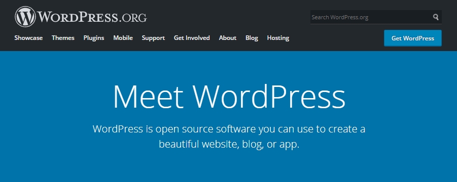
If you’re new to blogging, you’ve probably spent a lot of time trying to figure out what platform you should be using. There are a lot of blogging platforms and Content Management Systems (CMSs) to pick from. However, WordPress is my go-to choice for blogs:

Let’s break down why WordPress should also be your pick if you’re concerned about creating a mobile-friendly website:
- You have thousands of mobile-optimized themes to choose from.
- WordPress is incredibly popular, which makes it easy to find tutorials for anything you need.
- It enables you to build a blog and then grow it into anything you want thanks to its flexibility.
More importantly, starting a WordPress blog can be remarkably cheap. That means you can experiment and try over and over again until you get the hang of the platform, all without spending too much money.
How to Ensure Your Blog Is Mobile Friendly (4 Approaches)
Most of this advice applies whether you use WordPress or not (except for number one). If you decide to use another platform, keep this advice in mind!
1. Use a Mobile-Friendly Theme
Themes aren’t something that’s unique to WordPress. However, the CMS is in a league on its own when it comes to sheer numbers (and let’s not even talk about plugins).
A theme is a ‘simple’ collection of layouts and designs that you can apply to your blog. It helps you achieve a uniform design. There are thousands of WordPress blogging themes to pick from, both free and premium:

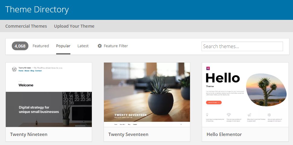
If you Google that search term (WordPress themes for blogs) you’re liable to spend hours narrowing down your options. A lot of fancy themes try to trick you into spending a lot of money for features you might not need, though. Here’s what you really need to look out for when it comes to blogging themes:
- Check out if they have a demo available.
- Test that demo on a computer and at least one mobile device, making sure it looks great on both.
- Take a look at the theme’s update history to make sure it’s not abandoned.
- Read multiple theme reviews to help make up your mind.
Unless you’re an experienced WordPress user, I recommend you stick with free themes. They don’t offer as many bells and whistles, but that’s a great thing since it enables you to focus on the writing.
Most modern WordPress themes are pretty responsive, so unless you choose an outdated one, you should be good to go.
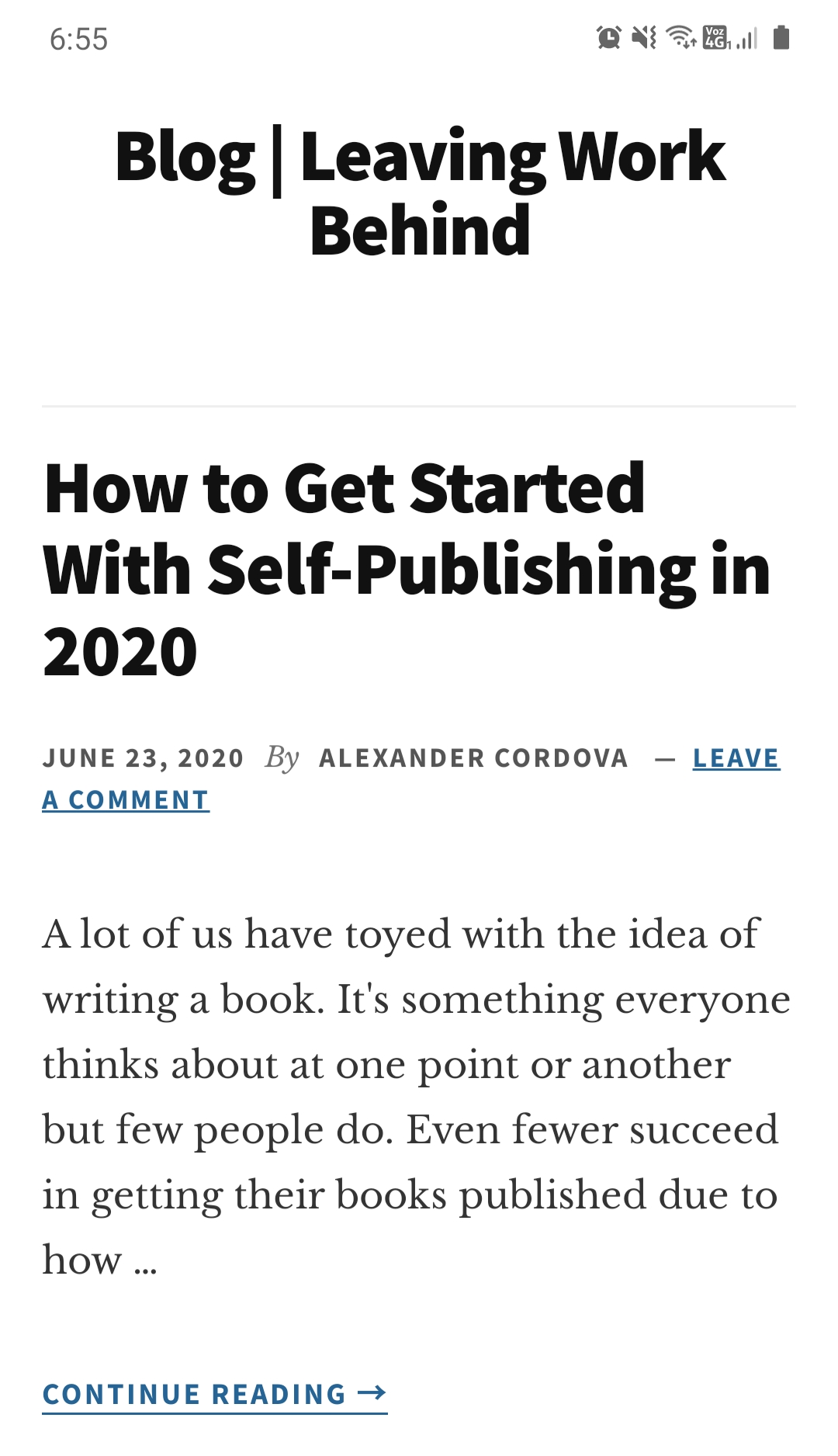
2. Test Your Blog on Mobile Devices
Once your blog is up and running, it’s important that you triple check how it looks on mobile devices. For this, I like to have at least one blog post up and multiple pages ready.
There are several ways you can go about this. The easiest one is to take your own smartphone and use it to browse your blog. Here’s what you need to look out for:
- Sections that are difficult to navigate on small screens
- Cluttered design (which is a pain on mobile devices)
- Buttons and links that you can’t press with ease
The cornerstone of mobile design should be usability. Since readers don’t use a mouse and are limited to small screens, you have to design your blog with that in mind.
A simple way to ensure your blog translates well to mobile devices is to ‘simplify’ its design by including plenty of negative space. If your navigation menu is uncluttered, that’s a bonus as well.
3. Reduce Loading Times
Ideally, you want your blog to load as fast as possible all the time. In practice, most people have an incredibly low tolerance for slow-loading sites. To put that into context, more than half of your potential audience will bounce if your blog takes over two seconds to load.
That’s a staggering figure and in the real world, most blog owners don’t put any work at all into optimization. I’ve seen it a thousand times, if someone’s site is slow, they blame WordPress, the person who built it, or their web host.
As a rule of thumb, WordPress usually isn’t the cause of your blog being slow, even if you have dozens of plugins active. Your website might, on the other hand, be poorly built and optimized.
Not all web hosts are equally good when it comes to performance either. Before you sign up with a provider, we recommend you look at plenty of reviews that focus on performance to see if they offer a good baseline.
Don’t be scared, though – there are plenty of blazing-fast hosts that offer cheap plans perfect for new blogs, such as Bluehost. As far as making your blog faster, once it’s been up for a few months, you can start to worry about optimization.
4. Focus on Improving Readability
If you want people to read your blog posts, you need to consider what that experience is like on small screens. One of my pet peeves is running into mobile websites that require me to zoom in to read anything.

Likewise, some fonts just don’t translate well to smaller devices. When you’re choosing your blog’s typography, you need to test it at different sizes to make sure it remains easy to read.
For blogs, the best thing you can do to increase readability is to remove clutter and use negative space so each line of text gets the room it needs. Those are two tips we already covered when talking about testing your mobile website.
If you use text on images, logos, and buttons, you also need to ensure those are easy to read. Your visitors are there to read, so make sure they can!
Conclusion
When you start a blog, it’s normal to focus on how it looks on a big screen. We pay close attention to every aspect of its design to ensure it’s perfect, but we often forget to make sure it looks just as well across a broad range of devices.
Ideally, your WordPress blog should look perfect on any device from a smartphone to a widescreen panel and everything in between. Here’s how to ensure it:
- Use a mobile-friendly theme.
- Test your blog on mobile devices.
- Reduce loading times.
- Focus on improving readability.
Do you have any questions about how to ensure your blog is mobile friendly? Let’s talk about them in the comments section below!
Image credit: Pixabay.