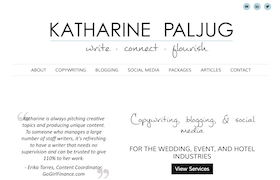
The following is a guest post from Katharine Paljug, a freelance writer and actor. You can follow her freelance adventure at Katharine Writes or visit her website (that used to stink), WeddingWriting.com.

Of course, nothing happened.
So I got my act together and went to work. I networked on social media. I wrote blog posts and sent out queries. I was ready to start making the big bucks.
Do you know what happened next? If you guessed more nothing, you are spot on.
Eventually, I sat down to figure out what was going wrong. The answer, when I finally admitted it to myself, was painful: my website stunk.
If you’re a freelancer trying to get clients and turning up nothing, it’s time to face the truth: your website probably stinks too. You might have experience, skill and a killer pitch. But if prospective clients are turned off by your website, they’re not going to hire you.
With that in mind, in this post I have outlined a number of reasons as to why your freelance website might be failing (as mine was!) and explained what you can do to turn things around.
1. No Website at All
Okay, this is one mistake I’m relieved I didn’t make. But there are tons of freelancers out there who don’t have a website!
Put simply, if you are still website-less in 2014, you are doing freelancing wrong. Buy a domain, download a theme, hire a designer…whatever works for you, just put something together.
Make sure you skip the free Wix-style site builders — the ads are distracting and make you look less professional. Invest in a domain and hosting if you want to look like you mean business.
2. Visual Clutter
The first problem I noticed with my website was how difficult it was to read. There was too much text on each page. There were half a dozen unnecessary pages. My color choices were jarring and distracting.
Potential clients are in a hurry. They don’t want to have to struggle to read your website. So simple is always better when presenting information online. Stick with:
- A few key pages. Make sure they have clear titles and are easy to navigate.
- Single lines of text, bullet points or very short paragraphs. Most people skim when reading online, so make it easy for your clients to find information quickly.
- A white background with dark text. Save colors to use as accents. And remember, there should be much more white space than text.
- Strategic use of images and graphics. Use them when they’re important and relevant, not just to fill space.
3. No Call to Action
One of the biggest mistakes I made on my website was the constant use of the word “if.”
If you’d like to get in touch…
If you have a problem with…
If you think you need help…
I never told potential clients exactly what to do. I left them hunting for my contact information. I never had a call to action.
Instead of using “if” or simply expecting clients to figure out how to get in touch, tell them exactly what to do.
Call me today at xxx-xxx-xxxx.
Sign up for my mailing list and get your free report!
Put your contact information out there. Consider having your phone number in the header. Give potential clients your email address instead of hoping they will fill out a contact form.
Each page on your website should have a call to action — a guide that leads visitors towards contacting you in a way that requires minimal effort.
4. Too Much Information
When I started to suspect my website wasn’t working, I asked a professional copyeditor (who also happened to be my mother) to look it over.
“I think it’s great!” she said. “I especially liked in your bio when you talked about how you’ve been writing since you were little, it was so sweet.”
As soon as I heard that, I knew I had a problem.
Clients didn’t care how young I was the first time I picked up a pencil. Clients weren’t going to hire me because I had a “sweet” story.
They were going to hire me because I could solve a problem they had.
When putting together the content of your website, make sure you:
- Focus on your clients and what you can do for them.
- Don’t get into too much personal backstory. A little will humanize you, but too much will make you seem self-obsessed.
- Don’t include every piece of work you’ve ever done. Use your best samples and leave it at that.
- Keep the most important things “above the fold.” Key information should be visible without needing to scroll down.
5. Sounding Phony
When I started freelancing, I wanted my website to make me sound professional and impressive. So I wrote as if I were part of a corporate team.
I didn’t realize what a huge mistake this was until I was on the phone with a potential client and had to explain that I couldn’t do a rush job for her because the “we” on my website actually just meant “me.”
It’s one thing to use a formal voice to pitch yourself to a certain market. Some people may need to do that. But if you’re trying to make yourself sound like a bigger business than you are…well, you probably come across sounding like a pretentious idiot.
Are you:
- Referring to yourself in the third person — or worse, in the third person some places and the first person in others?
- Using the royal “we” and talking about your “team” when the only team you have is you and your cat?
- Using words like “cogitate” to sound smart instead of just saying “think”?
Skip the five dollar words and perspective switches. Write as if you’re having a genuine conversation with your potential clients. Tell them, simply, why they should hire you.
Not only will your website be more convincing, it will help clients get to know the person you are, which will make them more likely to hire you.
So What Now? It’s Time to Take Action!
The good news is that once you know your website stinks, you can get to work fixing it.
However, reworking an entire website can feel so overwhelming that it’s easy to put it off, even once you know it needs to be done. I’ve been there: I spent nearly a month staring at my own bad website, knowing I needed to do something about it, but not being sure where to start.
If that’s how you’re feeling right now, don’t try to do everything at once and don’t just ignore the problem. Instead, take one action a day to start making your website shine.
Need some ideas?
- Read your website text out loud to find the parts that don’t sound like you.
- Ask a colleague look at pages on your website to see whether they’re easy to read quickly.
- Pick a new theme that has more white space, or contact a web designer.
- Try to cut your bio down to only one or two paragraphs.
- Rewrite one page on your website a day until you’ve gone through them all.
- Add your email address to your contact page.
(Tom: One other idea — ask the guys on the Leaving Work Behind Freelancing forum to take a look!)
Finding clients as a freelancer is challenging enough. Don’t let a bad website make it even harder. Take the time to make sure your website is working with you, not against you, and it will soon be the best marketing tool you have.
Are you making any of these mistakes on your own website? Have you discovered any tips for making a freelance website shine? Share your thoughts in the comments below!