

Everyone agrees on the power of email lists. However, even the most engaging email marketing strategy will fall flat on its face if you don’t have enough subscribers. To get there, you’ll need to level up your opt-in form game.
Email signup forms are usually pretty boring. You put them on a sidebar or a pop up and wait for the emails to roll in. However, there’s no rule that says your signup forms need to be boring. With the right email marketing platform, you can create some pretty cool opt in forms.
In this article, we’re going to take a look at seven examples of outstanding email signup forms and talk about what makes them work. That way, you’ll be able to grow your email list faster!
1. Mad Fientists
Let’s start with a very simple example. Mad Fientist is a website that deals in financial advice and it’s got a very no-nonsense style. Their opt-in form caught my eye because it’s very clean and not-salesy:

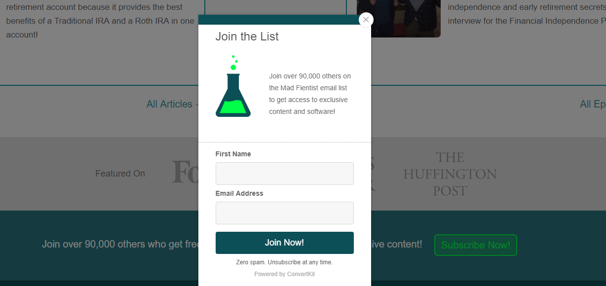
As you can see, they use a pop up that is easy to close and doesn’t take up over the entire screen. I’ve never been a fan of the full-screen options because they feel too intrusive, but this one strikes a nice balance.
The only thing I’d change, in this case, is the copy – they could include a bit more information about what type of content you can expect from their emails. Even so, most sign-up forms hardly include any information at all, so it’s a small nitpick.
2. Kate Spade
Kate Spade is an online store that specializes in women’s apparel. Unlike a lot of ecommerce shops, they take a very subtle approach to collecting emails. There are no pop ups here or prompts to subscribe at the top of the website. Instead, their opt in form is at the very bottom of every page:


The form itself is quite simple, but it reels you in with the promise of a hefty discount. That’s basic marketing and if you’re willing to give visitors a bargain, you can get away with a simple signup form. Even so, this one manages to look elegant, despite how straightforward it is.
3. Backlinko
If you like to read about SEO, then you’re probably already familiar with Backlinko. It’s one of the blogs with the most comprehensive SEO content on the web. As you’d expect, for SEO experts, their email signup forms are on point:


The style looks pretty simple, but let’s break down what that form gets right:
- The headline is short and to the point, focusing on benefits.
- Its CTA (Call to Action) uses bold colors to stand out.
- It includes a social proof element which tells you ‘Hey, it’s OK to trust these guys with your email!’
Social proof elements, such as reviews, testimonials, and even just pictures of you, are great when it comes to driving conversions. They can inspire trust and they’re something most people don’t think to include alongside their signup forms.
4. OptinMonster
Being aggressive about email signups isn’t my cup of tea, but I can’t deny it sometimes works. Take OptinMonster, for example – their whole business deals with this type of element, so you can assume they know what they’re doing. When you visit their website, this is what you’ll see:

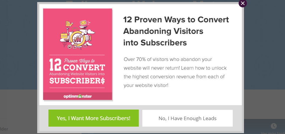
That’s some pretty pushy copy and clicking on a button that says “No, I Have Enough Leads” doesn’t seem all that enticing. When you click the green one, on the other hand, that’s when they hit you with the email signup form:

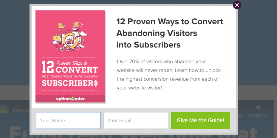
One interesting aspect of this approach is by getting you to ‘agree’ before leaving your email, you’re more likely to follow up on signing up. After all, you’re already committed to the process, which is what makes this form so effective.
5. Neil Patel
It should come as no surprise that an SEO expert such as Neil Patel knows his stuff when it comes to signup forms. In fact, this is one of the most stylish opt in forms we’ve run into so far:

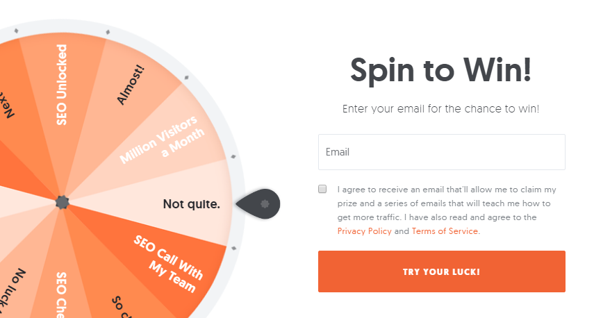
If you look closely, you’ll see the wheel doesn’t really promise anything outlandish. However, the mix of copy and style here add a gamification twist to the usual email signup fare. Plus, the use of color in this example is excellent, specially when it comes to the CTA.
6. Everlane
Everlane is a shoe store that doesn’t pull its punches when it comes to email marketing. These days, most websites hit you with the email signup pitch when you’re leaving. However, Everlane barely waits until you’ve set a foot inside before it puts an opt in form in front of you:

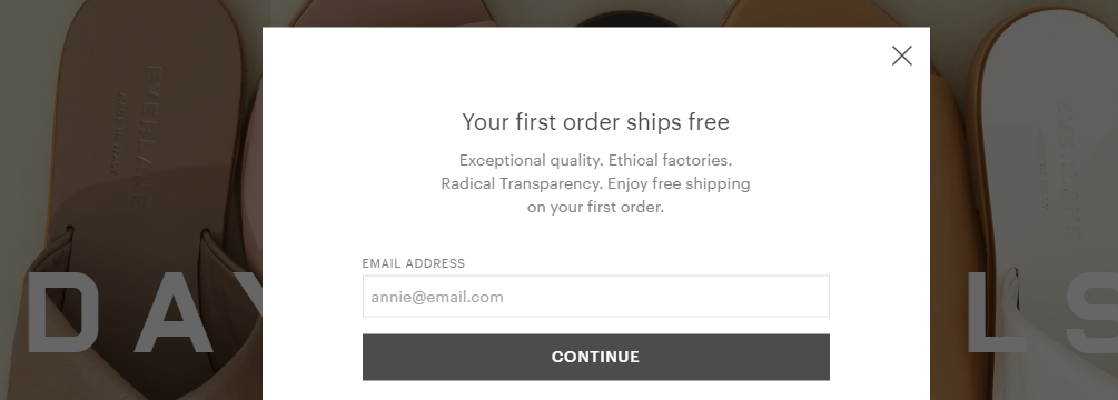
The design, in this case, is nothing to write home about. However, the copy itself is quite nice and it highlights the benefits of signing up. Plus, it comes with a free shipping offer, and I love free shipping.
There’s a lot to like here despite its apparent simplicity. However, if I’d change one thing it would be the typography within this form. The header and subtext could be bigger, which would make them more eye-catching.
7. Penguin Books
If there are two things I love in life, they are penguins and a great opt in form, and one of those things is true. Here’s an example of an email signup that’s pretty straightforward, but gets every element just right:


Notice, for example, the difference in size for the different text elements, which helps guide your eye. There’s also the excellent choice of contrasting colors between the background, text, and opt-in form. This makes the latter stand out.
The key takeaway here is, your opt in forms can have very simple layouts. However, with just a few small design tweaks, they can still steal the show.
Conclusion
If you want to get emails, you need to ask for them. An aggressive strategy works sometimes, but I’m more partial to the idea of finding opt-in form designs that catch visitors’ eyes.
Even with a great design, it’s important you put those email signup forms in places where users won’t miss them. That includes your sidebar, a sticky footer, an exit intent pop up, etc. You don’t lose anything by asking, so don’t be scared to do it.
Where do you think is the best place to put your email sign up form? Share your thoughts with us in the comments section below!
Image credit: Pixabay.